
Branding
Corporate Learning Campaign
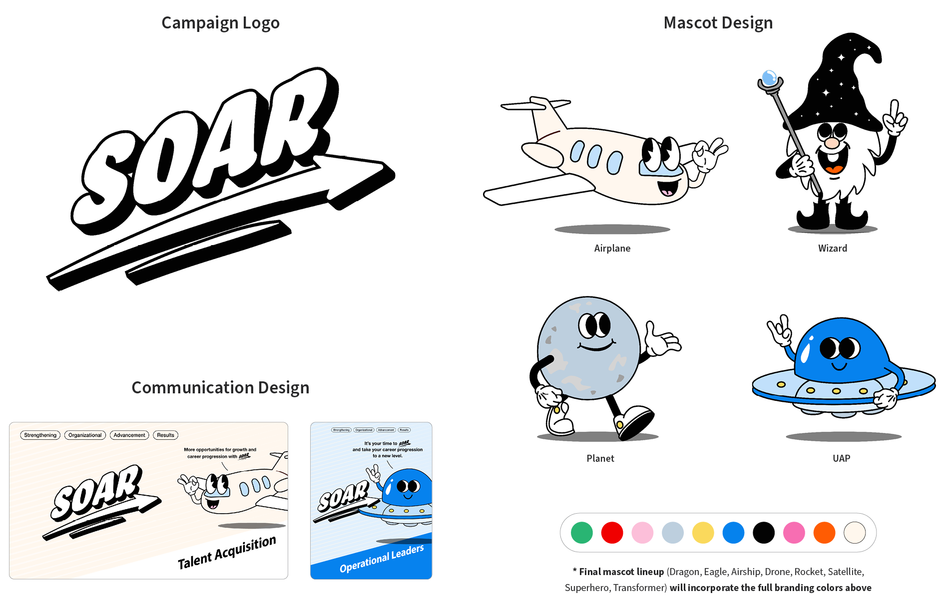
Seeking to inject vitality into the learning program, SOAR, we unveiled an energetic lineup of mascots known for their remarkable ability to soar to great heights with agility and speed, drawn in an amusing retro cartoon style.
Aligned with their roles within the organization, each of the 12 department teams will be entrusted with their distinct, charismatic mascot, setting the stage for a spirited learning competition. The objective is to ascend to new pinnacles, cultivating an environment of camaraderie, joy, and enthusiasm throughout the learning journey of organizational change and transformation.
Gourmet’s Street Food
Renowned for its distinctive family of trend-setting street food offerings in the fashion district, Gourmet’s had a clear vision for expansion. In response, I crafted a dynamic and evolving 9-circle logo, an icon that mirrors the company's ambitious business roadmap.
Recognizing the profound influence of fashion on Gourmet's two founders, I infused the brand's identity with elements of timelessness and sophistication. This thoughtful integration extends to their merchandise, exemplified by the minimalist leather clutch mirroring the iconic shape of Gourmet’s paper takeout bag. This fashion-forward offering presents an irresistible allure to discerning customers, combining an appreciation for both style and indulgence. The result is an immersive in-store experience driven by a captivating concept, seamlessly merging the worlds of culinary delight, fashion-forward aesthetics, and unbridled fun.

CDL Logo Rebrand
Acquired by BTS, Custom Digital Learning (formerly SwissVBS) is now a Center of Excellence (CoE) at BTS Group. CDL places custom designs at the center of everything we do. We craft immersive and unforgettable digital learning experiences that intricately weave each of our clients’ unique narrative.
As the Visual Design Team Lead at CDL, I drove the rebranding of the CoE logo to embody this exciting new chapter. Collaborating with two other talented designers, we presented the marketing department with over 10 design options in 3 rounds of iteration, achieving the final version as shown below in just 5 business days.

Global Digital Conference Event Branding
Our digital products’ versatility and range of offerings are represented by the hexagon shape (referred to as a “Hexagon” at BTS Digital to signify each digital learning topic). This hexagon design is formed by the three pivotal “D”s at the heart of the 2022 conference theme, seamlessly incorporating the company logo while emphasizing the profound importance of the 3 “D”s of the conference theme.
In exploring the interplay of Light Mode and Dark Mode within the digital product realm, I’ve artfully reimagined our BTS branding colors into two distinct palettes. These evoke the enchanting duality of Arabian Day and Arabian Night—a thematic fusion resonating with the essence of the beautiful conference venue.
